Apple Shares Liquid Glass Design Gallery - MacRumors
Skip to Content

Apple Shares Liquid Glass Design Gallery

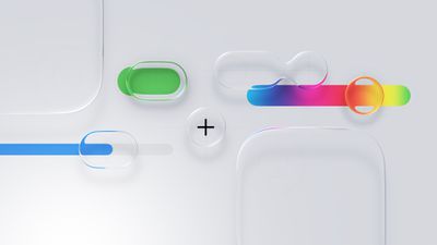
Apple is promoting the new Liquid Glass design in iOS 26, showing off the ways that third-party developers are embracing the aesthetic in their apps. On its developer website, Apple is featuring a visual gallery that demonstrates how "teams of all sizes" are creating Liquid Glass experiences.
Liquid Glass General Feature
The gallery features examples of Liquid Glass in apps for iPhone, iPad, Apple Watch, and Mac. Apple includes comparisons of how each app looked in iOS 18, and how it looks in ‌iOS 26‌.

Apple's examples feature apps that have eliminated bottom navigation bars in favor of smaller navigation options, apps with Liquid Glass sliders and buttons, and apps using popovers.

Featured apps include Crumbl, Tide Guide, GrowPal, Lumy, Sky Guide, Linearity Curve Graphic Design, LTK, American Airlines, Lowe's, Photoroom, OmniFocus 4, CNN, Essayist, and Lucid Motors.

The design comparisons are best viewed on Apple's site, and are worth checking out if you're curious about how third-party apps are incorporating Liquid Glass.
Popular Stories

Dynamic Island iPhone 18 Pro Feature

iPhone 18 Pro Prices Estimated Ahead of Apple Event Next Week

Thursday September 3, 2026 3:41 am PDT by
Less than a week before Apple debuts new iPhone 18 Pro models, research firm TrendForce has estimated the prices of the devices based on the latest hardware cost environment. TrendForce's price estimates compared to last year's models look like this: Model Starting Price Model Starting Price Change iPhone 17 Pro $1,099 iPhone 18 Pro $...
iPhone Handoff Feature

iOS 27 Introduces New 'iPhone Handoff' Feature

Wednesday September 2, 2026 12:35 pm PDT by
Apple has added a new "iPhone Handoff" feature to iOS 27 that will allow you to switch between two iPhones while using the same phone number on each device. This functionality was briefly mentioned during the WWDC 2026 keynote in June, on a slide that listed hundreds of new features coming in iOS 27 and corresponding software updates, but Apple never shared any further details at the time. ...
iPhone 18 Pro Dark Cherry Feature

iPhone 18 Pro Reportedly Starts With 256GB of Storage

Thursday September 3, 2026 9:22 am PDT by
While the iPhone 17 Pro has double the base storage compared to the iPhone 16 Pro, there will apparently be no further increase this year. Taiwanese research firm TrendForce today again reported that the iPhone 18 Pro models will start with 256GB of storage, like the iPhone 17 Pro models. Minimum storage capacities by model:iPhone 16 Pro: 128GB iPhone 17 Pro: 256GB iPhone 18 Pro...

Top Rated Comments

11 months ago
iOS 18 is so much cleaner.

This comparison makes it so obvious liquid glass adds nothing of value to the UX.
Score: 62 Votes (Like | Disagree)
iZac Avatar
11 months ago
Ahh, am I just a curmudgeon? For the most part prefer the left-hand screenshots because they're less 'noisy' - a clear interaction zone with the icons. The right-hand animations are mostly floating, transparent lozenges. They visually flicker and are intermittently illegible.
Score: 52 Votes (Like | Disagree)
klasma Avatar
11 months ago
I looked at all examples in the gallery, and the usability degradation just makes me sad. Hopefully Apple will realize at some point that this isn’t a good design for people who just want to get 💩 done on their devices.
Score: 43 Votes (Like | Disagree)
jchap Avatar
11 months ago
I wonder if these app developers can categorically say that incorporating Liquid Glass into their designs has made their apps better, easier to use, and more user-friendly, or just looking different…
Score: 33 Votes (Like | Disagree)
11 months ago
I actually really love Liquid Glass. I can understand why people may not. But you cannot please everyone. I also think too many people listen to tech YouTubers.
Score: 31 Votes (Like | Disagree)
midkay Avatar
11 months ago
I'm loving Liquid Glass more everyday. It just looks so refined and the refraction effects add so much visual interest compared to the "flat" textureless designs from the decade before.

The CNN comparison is a great example to me:


It's really nice to see the photos at the bottom extend fully downwards, bringing more color and life to the screen, rather than that large flat gray bar. A lot of people may argue this is not 100% "useful" or "necessary", but that's not the point. It looks and feels much nicer.

Attachment Image
Score: 28 Votes (Like | Disagree)