Apple is continuing to tweak the way that the Liquid Glass design looks ahead of the iOS 26 launch, and the latest beta makes a change to the Lock Screen.
The Lock Screen clock has been updated with additional transparency, allowing more of the background to peek through.
Beta 6 on left, beta 5 on right
The clock also has more of a 3D, floating look, which is in line with the rest of the Liquid Glass design. Apple didn't change the Liquid Glass look of the control buttons, but the icons are larger. Lock Screen widgets haven't changed.
Beta 6 on left, beta 5 on right
With the updated floating design and added translucency, the clock can be somewhat harder to see on certain darker backgrounds, but it is definitely more of a Liquid Glass aesthetic.
Apple has been tweaking different iOS 26 design elements throughout the beta testing process as it aims to perfect Liquid Glass before the iOS 26 debut in September.
Wednesday March 18, 2026 7:39 am PDT by Joe Rossignol
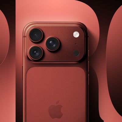
While the iPhone 18 Pro and iPhone 18 Pro Max are not expected to launch for another six months or so, there are already plenty of rumors about the devices.
It was initially reported that the iPhone 18 Pro models would have fully under-screen Face ID, with only a front camera visible in the top-left corner of the screen. However, the latest rumors indicate that only one Face ID component...
Wednesday March 18, 2026 11:56 am PDT by Juli Clover
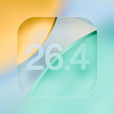
Apple provided developers and public beta testers with the release candidate versions of iOS 26.4 and iPadOS 26.4, which means we're going to see a public launch as soon as next week. The RC versions of the software include Apple's official release notes, giving us final details on what's included in the update.
Apple Music
- Playlist Playground (beta) generates a playlist from your...
Apple has unveiled a whopping eight new products so far this March, including an iPhone 17e, iPad Air models with the M4 chip, MacBook Air models with the M5 chip, MacBook Pro models with M5 Pro and M5 Max chips, an updated Studio Display, a higher-end Studio Display XDR, and now the AirPods Max 2 this week.
iPhone 17e features the same overall design as the iPhone 16e, but it gains Apple's...
I'm really not sure why this needs to keep being reiterated, but here we go again: the BEFORE image always goes on the LEFT, the AFTER goes on the RIGHT. Just like how we read english text, from left to right. Understand?
I fear this whole design is a failure and Apple is heading into a dead end. Much too complex to manage properly. As much as I love the idea, it might make sense in specific situations but not for the whole OS. Apple tried translucent UIs with Aqua (translucent menus) and quickly reverted back. Unreadable text and blurry UI just doesn't make sense.

 Beta 6 on left, beta 5 on right
 Beta 6 on left, beta 5 on right