App Store Connect App for Developers Gets Fresh Icon, New Features - MacRumors
Skip to Content

App Store Connect App for Developers Gets Fresh Icon, New Features

by

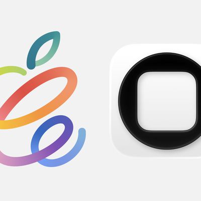
Apple today updated its App Store Connect app designed for developers, introducing a new icon that is a more complex version of the original simple blue and white "A" design.

appstoreconnect

New icon on the right

‌App Store‌ Connect is used by developers for iOS app management. It provides info on app statuses, offers data on app performance and sales, and lets developers access and respond to reviews.

Along with an updated icon, the new version of the app released today introduces an option for setting up internal TestFlight beta testing, with up to 100 members of a developer's team can test beta builds of an app. Full release notes for the update are below:

With this update, you can now:
- Set up internal TestFlight beta testing
- Add up to 100 members of your team to test beta builds of your app
- Edit test details for beta builds, view build activity and status, and expire builds
- Answer required export compliance questions

Developers can download ‌App Store‌ Connect from the ‌App Store‌. [Direct Link]

Top Rated Comments

thatvirtualboy Avatar
76 months ago
Eesh, if I didn't know any better I would think the 'old' icon was the newer one... looks way cleaner.
Score: 29 Votes (Like | Disagree)
skel_73 Avatar
76 months ago
They are legit going backwards with their design language. It looks like circa 2000.

I do branding and design for a living so maybe I've oversensitive to it, but I find the fact that they are doing this worrisome as it feels regressive and 'un-Apple' to me....
Score: 18 Votes (Like | Disagree)
76 months ago
Oh boy ... first we got Aqua look. Then the thin/simple look. Now back 'aqua-a-like' look.

Personally the new icon looks .. well .. ugly.
Score: 13 Votes (Like | Disagree)
76 months ago
That’s one ugly icon. Looks very out of place.
Score: 12 Votes (Like | Disagree)
AngerDanger Avatar
76 months ago
It's like Apple just realized within the last year that icons can have depth.
Score: 10 Votes (Like | Disagree)
BreuerEditor Avatar
76 months ago
Whatever happened to the 'simplicity' mentality? I thought we went from these 3D lots of 'depth' icons to flat to make them cleaner and simplistic (flat)? Now we're going back to that? 🤔
Score: 9 Votes (Like | Disagree)

Popular Stories

Apple Acquires Award Winning App Play Feature

Apple Acquires Award-Winning App 'Play'

Monday June 29, 2026 7:39 am PDT by
In February, Apple notified the European Commission that it would be acquiring certain assets from and have the right to hire certain employees from Rabbit 3 Times, the company behind the award-winning app design tool Play. The notification was published on the European Commission's website this week, following a four-month waiting period. Play was a Mac and iPhone app that allowed designers ...
app store blue banner uk fixed

UK Pushes Apple to Loosen App Store Payment and NFC Rules

Tuesday June 30, 2026 3:00 am PDT by
The U.K.'s competition regulator has proposed letting app developers direct users to payment options outside Apple's App Store and Google's Play Store, in a move aimed at increasing competition and reducing the fees charged by the two companies. As reported by Reuters, the Competition and Markets Authority (CMA) said the proposals would remove restrictions that currently prevent U.K....
app store blue banner epic 1

Supreme Court Will Hear Apple's Appeal in Epic Games App Store Fight

Tuesday June 30, 2026 10:34 am PDT by
The United States Supreme Court has agreed to hear Apple's appeal against the contempt ruling that forced it to change its App Store linking rules, reports Reuters. In a statement to MacRumors, Apple said the court's decision was welcome news. This is an important question of law and we are pleased the Supreme Court will hear our case. Apple asked the Supreme Court to review the decision...