Jony Ive Put Apple's Marketing Team in Charge of iOS 7 Icon Design
 The Next Web has given us a peek behind the scenes at the development of the new and controversial user interface in iOS 7.
One of the more revealing points in the piece is that Jony Ive, recently put in charge of software as well as hardware design, tapped Apple's marketing and communications team -- MarCom -- to design the look and feel of the icons. Then, with those as a guide, the iOS design teams went to work.
First of all, many of the new icons were primarily designed by members of Apple’s marketing and communications department, not the app design teams. From what we’ve heard, SVP of Design Jony Ive (also now Apple’s head of Human Interaction) brought the print and web marketing design team in to set the look and color palette of the stock app icons. They then handed those off to the app design teams who did their own work on the ‘interiors’, with those palettes as a guide.
The site
goes on to note that the design is "firmly a 'work in progress'", and that the look and feel of the icons and other new UI bits are likely to change significantly as the iOS 7 beta proceeds.
Popular Stories
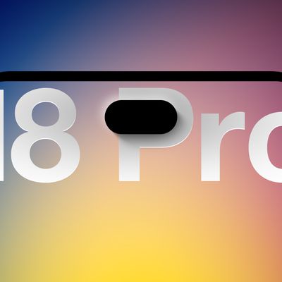
We're only four months out from the launch of Apple's premium next-generation smartphone lineup, and while we're not expecting a sea change in terms of functionality, there are still several enhancements rumored to be coming to the iPhone 18 Pro and iPhone 18 Pro Max.
One thing worth noting is that Apple is reportedly planning a major change to its iPhone release cycle this year, adopting a...
Apple released iOS 26.5 after a few months of beta testing, and while it doesn't have the Siri features we were hoping for since those are being held until iOS 27, there are a handful of useful changes worth knowing about.
Subscribe to the MacRumors YouTube channel for more videos.
End-to-End Encryption for RCS
Support for end-to-end encryption (E2EE) for RCS messages between iPhone and...
Social network Reddit recently began blocking mobile visitors to its website while pushing them to download the official Reddit app, and it's fair to say that the move is not going down well with users.
If you visit reddit.com on your iPhone today, you may see a new popup that can't be dismissed, asking you to "get the app to keep using Reddit."
A Reddit spokesperson told Ars Technica...