macOS 27 Golden Gate Reverses a Divisive Tahoe Design Choice
In macOS 27 Golden Gate, Apple has removed many of the menu item icons that are so prevalent throughout macOS 26 Tahoe, as spotted by Nikita "Tonsky" Prokopov (via Daring Fireball). The developer shared before-and-after screenshots on Mastodon to evidence the reversal.
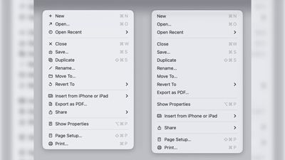
Menu item icons in macOS 26 (left) vs. macOS 27 (image: Nikita Prokopov)
Tahoe was the first version of macOS to place a small icon next to nearly every entry in the menu bar across Apple's apps, but the change drew swift criticism from designers and developers. Many of the icons are inconsistent and often difficult to understand on their own, with different Apple apps showing different icons for the same menu items.
The third-party developer pushback was strong enough that some even adopted open-source code provided by NetNewsWire's Brent Simmons to switch the icons off by default.
In Golden Gate though, they're gone – or only used where genuinely useful. Apple has also revised its Human Interface Guidelines to tell developers to use menu item icons "sparingly and with purpose," reserving them for common actions, file system locations, connected devices, and similar cases.
macOS 27 is currently in developer beta, with a public beta to arrive next month, followed by a general release in the fall.
Popular Stories
In a post on its developer news website today, Apple announced that it will be introducing "additional controls" for the "Full Disk Access" setting on macOS due to new risks posed by AI agents. This announcement comes amid the rise of always-on AI agents like Meta's Muse and OpenAI's Dots, which have prompted privacy concerns.
"Some developers are using Full Disk Access in ways that could...
Apple today released macOS 27.0.1, the first update to the macOS Golden Gate operating system that came out in mid-September.
Mac users can download the new macOS Golden Gate software by using the Software Update section in System Settings.
Apple says macOS Golden Gate 27.0.1 fixes unspecified bugs. Apple has also released macOS 26.7.1 and macOS 15.8.1 security updates. ...
macOS Golden Gate 27.2 adds code referencing new touch-specific gestures in apps like Safari, Notes, Photos, and Quick Look, a possible sign Apple is preparing to release the rumored OLED touchscreen MacBook, possibly called the "MacBook Ultra."
Code in the latest beta adds new gesture recognition tools to several Apple apps. Safari gets a touch sentinel recognizer, Photos has...