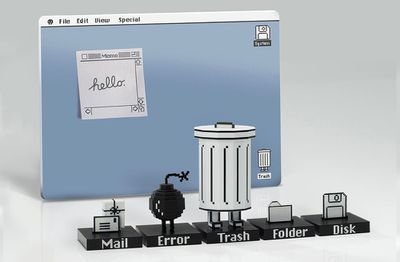
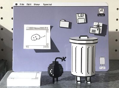
Designer Philip Lee, known for creating a range of fun Mac-themed desktop toys, has launched a new stationery product called Trashbot 2.0. The Trashbot set features a collection of desk accessories that are fashioned to look like the Classic Mac OS from the 1980s.
There's a whiteboard that looks like a Mac desktop, a Trashbot figure that is designed to hold pens, a 200 page Memo Pad, an Error Bot figure, and three desktop icons with magnetic backs that look like the old Mail, Folder, and Disk icons. The little magnetic icons can be attached to the whiteboard to hold notes from the Memo Pad.
The Mail, Folder, and Disk icons feature a display stand with metallic name tag, as do the Trashbot and Error Bot.
The Trashbot 2.0 Stationery Set can be purchased from the Classicbot website for $46, and there are a limited number of the desk accessories in stock.
Friday September 18, 2026 4:27 pm PDT by Juli Clover
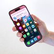
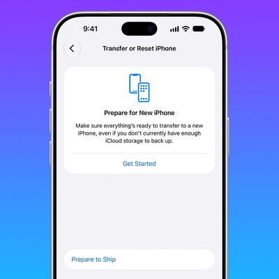
The iPhone 18 Pro Max has a battery capacity over 20 watt-hours, which means there are additional shipping requirements. If an iPhone 18 Pro Max needs to be shipped somewhere, its maximum battery capacity has to be limited through firmware.
According to Apple, the iPhone 18 Pro Max uses an "innovative battery-firmware solution" that limits battery capacity to below 20Wh between when the...
Friday September 18, 2026 10:07 am PDT by Joe Rossignol
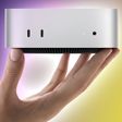
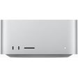
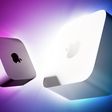
Last month, Apple announced new Mac mini and Mac Studio models, and the computers are finally set to launch this coming Tuesday, September 22.
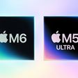
The new Mac mini is available with M6 and M5 Pro chip options, while the new Mac Studio can be configured with M5 Max or M5 Ultra chips.
To learn more, read our coverage:Apple Announces New Mac Mini With M6 and M5 Pro Chips and More
Apple Unveils ...
Sunday September 20, 2026 7:24 pm PDT by Joe Rossignol
In May, Apple agreed to pay $250 million to settle a U.S. class action lawsuit over Siri AI's delayed launch, and the settlement website is now live.
Apple will pay an estimated $25 per eligible iPhone to eligible customers, who can submit a claim via the settlement website between September 21 and December 21 of this year. The exact payment may be higher or lower than $25 depending on the...
Peak beauty! I hope one day Apple returns to this design language even as a theme:
The Aqua theme and and how it visually bridged hardware and UI was huge at the time. It influenced industrial design for other companies for years. It was the look of the late 90's early 2000's. Personally I was over it, and happy for the more subtle flatter look, but definitelty have fond memories!
Man, I wish so bad we could get WindowShades back from the classic Mac OS days. The ability to roll up your application into the title bar was just amazing and so useful. Still sad they removed it and any third party options are really janky.
But hey, Stage Manager is really useful, right? Right?
(TBF I kid - I do use Stage Manager, but it’s not nearly as handy as WindowShades were)
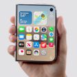
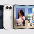
Apple's first foldable iPhone, with a book-style design featuring a 5.4-inch outer display and a 7.6-inch inner display with a minimal crease down the middle.




/https://forums.macrumors.com/proxy.php%3Fimage=https://photos2.insidercdn.com/leopard-review-conclusion-5.png&hash=c9c086f63528937905f6a0ed1af2987f)