Relay FM co-founder Stephen Hackett today shared an extensive collection of screenshots for every major release of the Mac operating system in the past 18 years, over which time its name has changed from Mac OS X to OS X to macOS.

macos cheetah public beta
The library of over 1,500 screenshots is available on Hackett's blog 512 Pixels, providing a look back at the visual history of Mac OS X Cheetah in 2000 through macOS High Sierra in 2017. Hackett plans to update the library for every major release of macOS going forward, including Mojave in the next couple of months.

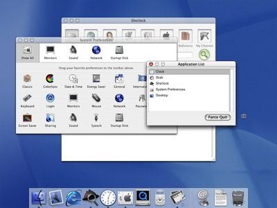
Hackett says he ran every macOS release on actual hardware, including various models of the Power Mac G4, Mac mini, and MacBook Pro, capturing screenshots of major features and other elements he felt were important over the years.

os x leopard
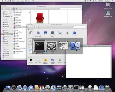
The screenshots show the evolution of the Mac's visual theme Aqua, ranging from gloss and pinstripes in the early days, to brushed metal and corinthian leather during the skeuomorphic days, to the flatter, translucent look of today. Highlights are available in a related blog post on 512 Pixels.

Hackett says he put an extraordinary amount of time into the collection, which is certainly worth checking out for a trip down memory lane.

Top Rated Comments

Porco Avatar
63 months ago
It used to be so gorgeous... *sigh*

I genuinely miss the way OS X looked, especially up to Leopard. Snow Leopard to Mavericks was fine. Everything after that is so bland by comparison, IMHO.
Score: 17 Votes (Like | Disagree)
Secondempire Avatar
63 months ago
Snow Leopard was beautiful. It feels like the world in 2009 was also a better place in general.
Score: 13 Votes (Like | Disagree)
asdavis10 Avatar
63 months ago
Bring back the welcome intro/vid!
Score: 13 Votes (Like | Disagree)
jayducharme Avatar
63 months ago
It used to be so gorgeous... *sigh*

I genuinely miss the way OS X looked, especially up to Leopard. Snow Leopard to Mavericks was fine. Everything after that is so bland by comparison, IMHO.
I miss the Forstall days. Maybe the leather and wood grain looked tacky to some, but it fulfilled Jobs' idea that technology should put a smile on the user's face. There was a visual coherence to OS X in the early days (as well as the iPhone) and that coherence helped make the interface intuitive. I don't think the current os is "bland" but it definitely has lost its personality. There's a sameness to everything now, a consistency that, ironically, is no longer as intuitive to use.
Score: 11 Votes (Like | Disagree)
MakeAppleAwesomeAgain Avatar
63 months ago
Although there is a lot to be critizied today, I must say the pre-flat releases look a bit dated now.
Score: 9 Votes (Like | Disagree)
randolorian Avatar
63 months ago
The corinthian leather in Lion's iCal looks terrible.
Score: 8 Votes (Like | Disagree)