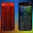
Apple Music has a new black-and-white logo and app icon, with Apple doing away with the red color scheme that it previously used for the streaming music service.
In a YouTube video released earlier today, Apple showed how the new Apple Music visuals were "made by sound." The video showed off the new Apple Music logo with colorful animations, despite the new Apple Music app icon in the iOS 27.2 beta having a more basic black-and-white design. It is unclear if a splash of color will be added later.
Apple Music's new app icon on the iOS 27.2 beta on the left, old icon on the right
Apple Music has also received a distinct font with a modern, impactful aesthetic.
The rebrand will roll out with Apple's next software releases, including iOS 27.2 and macOS 27.2. The updates are expected to be released next week.
Friday October 23, 2026 7:11 am PDT by Joe Rossignol
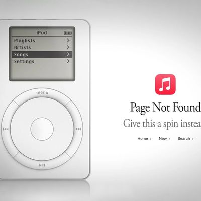
Apple Music has a 404 page easter egg on the web: a functional iPod that appears when you load a page that does not exist, such as music.apple.com/macrumors.
"Page Not Found," says Apple. "Give this a spin instead."
Apple is clever with this. If you navigate to music.apple.com/ipod instead, the page says "Looking for something?" instead of "Page Not Found."
The easter egg is only...
Wednesday October 21, 2026 9:06 am PDT by Joe Rossignol
Following the introduction of a new Apple Music logo and app icon earlier this month, Apple today officially introduced Apple Music's new brand identity.
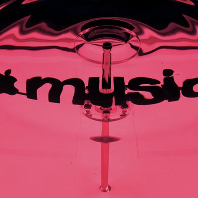
In a YouTube video shared today, Apple said the new Apple Music visuals were "made by sound." More specifically, Apple said it played a sound through a container of water, resulting in the liquid moving at the frequency of the notes. Apple...
Tuesday November 3, 2026 4:05 pm PST by Juli Clover
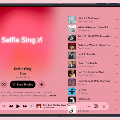
iOS 27.3 adds a new "Selfie Sing" feature in Apple Music that lets users record themselves while singing a song.
There's a dedicated Selfie Sing playlist and a selfie camera view that shows lyrics on the screen while also recording a video. Apple has a description of the feature:
There are some songs everyone knows by heart, the ones that come on and suddenly the whole room's singing along. ...
I’m genuinely confused - if the idea here was to rebrand and utilize this water or “liquid” esthetic, why doesn’t this rebranding extend to the actual app ICON?!?
Did the icon not get the memo? Is it on strike? Is the black and white to signal that it’s mourning the loss of the old look? Extremely odd.



 Apple Music's new app icon on the iOS 27.2 beta on the left, old icon on the right