iCloud Interface Gets Overhaul in iOS 18

In iOS 18, iPadOS 18, and macOS Sequoia, Apple revamped the iCloud section of the Apple Account (formerly Apple ID) that's available in the Settings app. The redesigned interface has much of the same functionality, but a "Saved to ‌iCloud‌" feature makes it clearer how storage is being used.
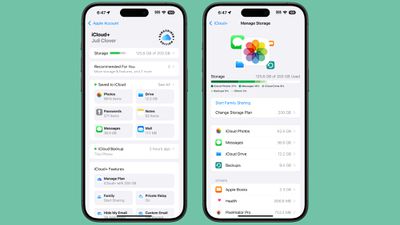
icloud redesign ios 18
Saved to ‌iCloud‌ replaces Apps Using ‌iCloud‌, and it provides more information at a glance. Rather than just listing whether ‌iCloud‌ is on for an app, you can see how much storage space Messages takes up, how many Notes are stored, how many Photos are in ‌iCloud‌, and more.

Tapping into each section provides additional detail and tools for managing storage, much of which was available before. While the main interface no longer shows where the majority of ‌iCloud‌ storage is going by file type, tapping the Storage bar shows the full breakdown and list of apps using the most storage.

If you subscribe to ‌iCloud‌+, there's a new "Subscriber Edition" icon, which is similar to the icon that Apple uses for Apple News+. ‌iCloud‌+ features can be listed and managed through the ‌iCloud‌+ section.

There's also a more prominent "Recommended For You" suggestions interface that recommends things like deleting inactive backups, upgrading to a new ‌iCloud‌+ plan, and more, along with quicker access to ‌iCloud‌ backups.

Related Forums: iOS 18, iPadOS 18

Popular Stories

m5 macbook pro deal

Why You Shouldn't Buy the Next MacBook Pro

Tuesday February 10, 2026 4:27 pm PST by
Apple is planning to launch new MacBook Pro models as soon as early March, but if you can, this is one generation you should skip because there's something much better in the works. We're waiting on 14-inch and 16-inch MacBook Pro models with M5 Pro and M5 Max chips, with few changes other than the processor upgrade. There won't be any tweaks to the design or the display, but later this...
iOS 26

Apple Releases iOS 26.3 and iPadOS 26.3

Wednesday February 11, 2026 10:07 am PST by
Apple today released iOS 26.3 and iPadOS 26.3, the latest updates to the iOS 26 and iPadOS 26 operating systems that came out in September. The new software comes almost two months after Apple released iOS 26.2 and iPadOS 26.2. The new software can be downloaded on eligible iPhones and iPads over-the-air by going to Settings > General > Software Update. According to Apple's release notes, ...
Apple Logo Zoomed

Apple Expected to Launch These 10+ Products Over the Coming Months

Tuesday February 10, 2026 6:33 am PST by
It has been a slow start to 2026 for Apple product launches, with only a new AirTag and a special Apple Watch band released so far. We are still waiting for MacBook Pro models with M5 Pro and M5 Max chips, the iPhone 17e, a lower-cost MacBook with an iPhone chip, long-rumored updates to the Apple TV and HomePod mini, and much more. Apple is expected to release/update the following products...
iPhone 16e Bottom Crop

Apple Reportedly Unveiling a New iPhone Next Week

Tuesday February 10, 2026 1:51 pm PST by
Apple plans to announce the iPhone 17e on Thursday, February 19, according to Macwelt, the German equivalent of Macworld. The report said the iPhone 17e will be announced in a press release on the Apple Newsroom website, so do not expect an event for this device specifically. The iPhone 17e will be a spec-bumped successor to the iPhone 16e. Rumors claim the device will have four key...
Apple Logo Black

Apple Acquires New Database App

Wednesday February 11, 2026 6:44 am PST by
Apple acquired Canadian graph database company Kuzu last year, it has emerged. The acquisition, spotted by AppleInsider, was completed in October 2025 for an undisclosed sum. The company's website was subsequently taken down and its Github repository was archived, as is commonplace for Apple acquisitions. Kuzu was "an embedded graph database built for query speed, scalability, and easy of ...

Top Rated Comments

22 months ago
Looks like an Android..
If there’s no enforcement and central guidelines, people tend to learn from other products on the market- Android and Microsoft.

So there really no surprise. Apples’ software design have zero consistency nowadays. I don’t want them to update old UIs, they are just ruining them.

Apple Music’s now playing bar had really great, fluid, and responsive animations. There was a WWDC talk on it with iPhone X release as well. But they failed to scale that ideology throughout the company. Apple Podcasts, with similar layouts didn’t have the same animation. Apple music classic had worse (****) animation. And again in iOS 18, they completely ruined it in the main Music App.

The new navbar/tab on iPad is also so weird as well. When you shrink the app to iPhone size, it will go to the bottom. So the same navigation component can be on the top, the side, and on the bottom on one single device.

The new calculator have a hamburger styled menu, wtf?

The button in the password app has a really weird button on the landing/greeting page.

The buttons in the new Photos app now live in a circle border. IOS button used to be borderless or rounded rectangles. And iOS now have three different types of rounded rectangles: circular, continuous, and a proprietary one used in homes app.

The filter button groups is different in almost single App, with a new look coming in the new mails App.

There are various types of search bar, and their interactions are different.

The new control center have circle and rounded rectangle buttons, which can transform from one to another, and the border radius doesn’t match!!!
Score: 21 Votes (Like | Disagree)
NC12 Avatar
22 months ago
What’s with the “Subscriber Edition” badge. It looks so out of place.
Score: 19 Votes (Like | Disagree)
Havalo Avatar
22 months ago
How about selective restore, Tim? ??‍♂️
Score: 8 Votes (Like | Disagree)
DeepIn2U Avatar
22 months ago
The iPhone is a personal device, like many other smartphones right? We can all agree on this.

So WHY ON EARTH does iCloud or Settings in iOS and iPadOS NEED to show the person's full name and picture at the TOP of screen when the account has NEVER been changed to another?!

Does everyone around me - especially sitting in a public area or on public transit or at work - counterparts that are NOT my colleagues yet near me at say a major corporate meeting - NEED TO KNOW my FULL name by overlooking my screen?!

Surely I, nor YOU on your iPhone (or any phone as I'm on Samsung so they get the same ire here) - NEED to know our OWN NAME in any Settings or Cloud application on device. SHOW it 1 time ONLY with end user option to hide or remove it UNTIL the account has changed and with a warning whenever that is done!
Score: 7 Votes (Like | Disagree)
frost_horizon Avatar
22 months ago
There are a lot of really controversial design decisions in iOS 18. Some of them are really ugly. I cannot imagine how this ugly badge would come up in production.
Score: 6 Votes (Like | Disagree)
klasma Avatar
22 months ago

Looks like an Android..
If there’s no enforcement and central guidelines, people tend to learn from other products on the market- Android and Microsoft.

So there really no surprise. Apples’ software design have zero consistency nowadays. I don’t want them to update old UIs, they are just ruining them.

Apple Music’s now playing bar had really great, fluid, and responsive animations. There was a WWDC talk on it with iPhone X release as well. But they failed to scale that ideology throughout the company. Apple Podcasts, with similar layouts didn’t have the same animation. Apple music classic had worse (****) animation. And again in iOS 18, they completely ruined it in the main Music App.

The new navbar/tab on iPad is also so weird as well. When you shrink the app to iPhone size, it will go to the bottom. So the same navigation component can be on the top, the side, and on the bottom on one single device.

The new calculator have a hamburger styled menu, wtf?

The button in the password app has a really weird button on the landing/greeting page.

The buttons in the new Photos app now live in a circle border. IOS button used to be borderless or rounded rectangles. And iOS now have three different types of rounded rectangles: circular, continuous, and a proprietary one used in homes app.

The filter button groups is different in almost single App, with a new look coming in the new mails App.

There are various types of search bar, and their interactions are different.

The new control center have circle and rounded rectangle buttons, which can transform from one to another, and the border radius doesn’t match!!!
Yep, and with the sheer volume of first-party software that now ships with iOS and only continues to grow, there is no hope that the designs will ever be consolidated. At this point, Samsung's OneUI feels more consistent than iOS.
Score: 5 Votes (Like | Disagree)