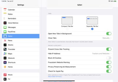
The fourth beta of iPadOS 15 that was released today introduces tweaks to Safari, with the Safari layout now mirroring the updated layout that was introduced in macOS Monterey Beta 3.
The new Safari design in iPadOS 15 beta 4
Prior to this beta, Safari on iPad was similar to Safari on iOS with no dedicated tab bar, but after the update, Apple has added a dedicated tab bar that's activated by default, which is the same layout that's now used in macOS Monterey.
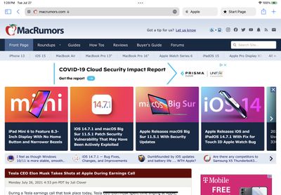
The original Safari design in iPadOS 15 beta 3
While the separate tab bar is enabled automatically when updating, in the Safari section of Settings, there is an option to toggle on the original compact tab bar that merged everything together.
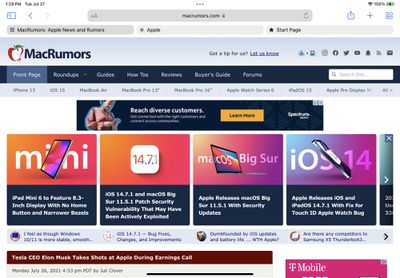
Apple in iOS and iPadOS 15 introduced a compact and unified Safari design that did away with the dedicated URL and search interface, instead letting any individual tab be used for navigation input.
This design has not been popular with users, which has led to Apple making some changes during the beta testing period. As of now, Safari on iPadOS mirrors Safari on macOS Monterey, though additional design tweaks could come in the future.
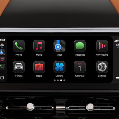
Last year, Apple launched CarPlay Ultra, the long-awaited next-generation version of its CarPlay software system for vehicles. Nearly a year later, CarPlay Ultra is still limited to Aston Martin's latest luxury vehicles, but that should change fairly soon.
In May 2025, Apple said many other vehicle brands planned to offer CarPlay Ultra, including Hyundai, Kia, and Genesis.
CarPlay Ultra...
Bloomberg's Mark Gurman today revealed another iOS 27 change: notifications will slide in from the left side of the screen instead of from the top.
In addition, accessing Notification Center on iOS 27 will require swiping down on the top-left corner of the screen. If you swipe down on the Dynamic Island area, a new "Search or Ask" interface tied to the revamped Siri will appear, instead of...
Apple has several hardware releases in the pipeline, but will we see any of them unveiled at this year's Worldwide Developers Conference?
WWDC is primarily a software event where new versions of iOS, iPadOS, macOS, watchOS, tvOS, and visionOS take center stage, but it's not unusual for Apple to introduce new hardware during the developer conference. Take WWDC 2017, for example, where Apple...
It is interesting that - at least to me - the UX of the icons in the options page is better than the actual implementation. The blue bars clearly indicate what is selected. The actual implementation leaves me confused.
Why do the bubbles have white padding below them? If they're not connected to the web content rectangle then it breaks the metaphor of what a tab is.
I totally agree. Not having the tab connected to the content it is associated with makes it much harder to know which tab is the active one. This update is better than the previous beta but I think it’s still worse than Safari 14.