Apple today released the fourth beta of iOS 8, which brings a number of improvements, changes, and bug fixes to the beta software that was first introduced on June 2.
iOS 8 beta 4 includes several minor interface tweaks and modifications that make the beta feel both faster and more polished. We've gathered up a comprehensive list of the enhancements that have been bundled into the release below, and to find out about all of the under-the-radar tweaks in iOS 8 so far, make sure to check out our iOS 8 Hidden Features Roundup.
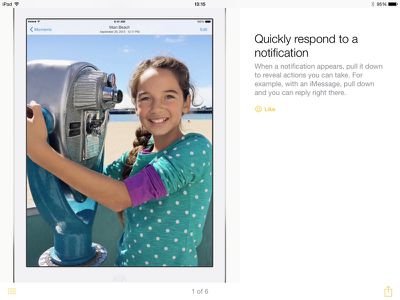
Tips: The Tips app that was first hinted at during WWDC has surfaced in iOS 8 beta 4, giving users tips on how to use iOS 8 on a weekly basis. For example, there are directions on using quick notification responses, sending voice messages, using notifications for Mail responses, activating Siri hands-free, and more. The Tips app is a default iOS app and cannot be uninstalled.
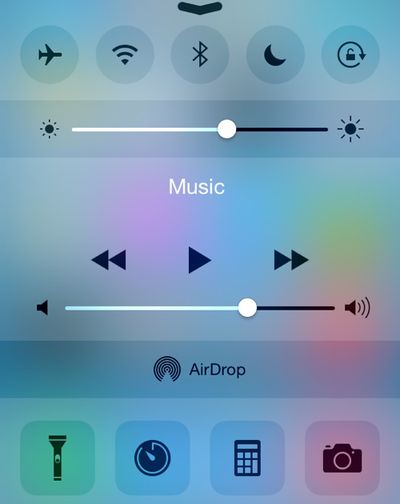
Control Center: The Control Center has seen a redesign that removes the black borders around the icons on the top and bottom and turns icons white when activated.
Display Settings: There's a new Display & Brightness section that's been unbundled from Wallpaper, with options to adjust screen brightness, text size, and activate bold text.
HomeKit: The Privacy section of the Settings app has gained a new Home Data icon.
Messages: The Messages section of the Settings app has new options for Message storage that includes separate expiration options for Audio and Video Messages. The Talk-to-Type option in Messages now displays spoken text in real time rather than waiting for an entire message to be complete before displaying text.
Bug Reporter: The Bug Reporter app that came installed by default in previous betas has been removed.
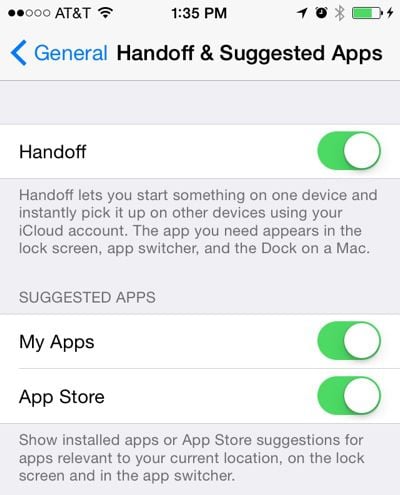
Handoff and Suggested Apps: There are new options in the Setting app to toggle Handoff on and off, but it does not appear to be present on the iPhone 4s. There's also a new section that allows users to toggle on Suggested Apps, which offer app suggestions relevant to location. This setting can be used to show only installed apps, or both installed apps and App Store apps.
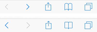
Safari Bookmarks: The icon for Bookmarks within Safari has been tweaked slightly. In the image below, the new version is on the top and the old version is on the bottom.
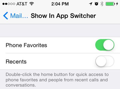
Contacts: Under the Mail, Contacts, and Calendars heading in the Settings app, there's a new option to toggle off Favorites and Recents for Contacts within the App Switcher.
Keyboard Settings: The option to toggle on the QuickType keyboard within the Keyboard section of the Settings app is now labeled as "Predictive" instead of "QuickType."
Spotlight Search: There are new options to remove Voice Memos and Bing Web Results from Spotlight Search in the Settings app.
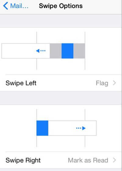
Mail: Swipe left and swipe right gestures in the Mail app can be assigned to different functions in the Mail, Contacts, and Calendars section of the Settings app.
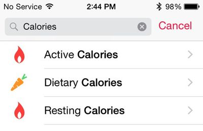
Health: The Calories section of the Health app has been split into Active, Dietary, and Resting calories.
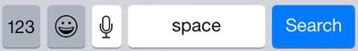
Emoji Keyboard Icon: The icon for Emoji on the keyboard has been updated with a happier smiley face.
iCloud Photo Library: It's now possible to select a length of time when pausing iCloud Photo Library in the iCloud section of the Settings app.
Additional features in iOS 8 beta 4 will be added here as they are discovered. Apple is likely to continue pushing regular updates to iOS 8 at two or three-week intervals to bring minor performance boosts and changes ahead of the operating system's launch. iOS 8 is expected to be released to the public in the fall. For more information on iOS 8's features, major and minor, make sure to check out our roundups.