Appleinsider.com claims that Apple is working on more finishing touches to the Panther interface, as well as speed improvements and additional animations.
In addition, there are reports that the "Brushed Aluminum" system theme will undergo some revisions over the next year with darker colors and a smoother interface.
Meanwhile, there's been some recent speculation on changes to the Apple logo after a new chrome Apple logo appeared in the most recent builds of Panther.
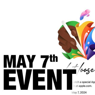
Apple has announced it will be holding a special event on Tuesday, May 7 at 7 a.m. Pacific Time (10 a.m. Eastern Time), with a live stream to be available on Apple.com and on YouTube as usual. The event invitation has a tagline of "Let Loose" and shows an artistic render of an Apple Pencil, suggesting that iPads will be a focus of the event. Subscribe to the MacRumors YouTube channel for more ...
Wednesday April 24, 2024 3:39 pm PDT by Juli Clover
Apple today released several open source large language models (LLMs) that are designed to run on-device rather than through cloud servers. Called OpenELM (Open-source Efficient Language Models), the LLMs are available on the Hugging Face Hub, a community for sharing AI code. As outlined in a white paper [PDF], there are eight total OpenELM models, four of which were pre-trained using the...
Apple has dropped the number of Vision Pro units that it plans to ship in 2024, going from an expected 700 to 800k units to just 400k to 450k units, according to Apple analyst Ming-Chi Kuo. Orders have been scaled back before the Vision Pro has launched in markets outside of the United States, which Kuo says is a sign that demand in the U.S. has "fallen sharply beyond expectations." As a...
Apple is finally planning a Calculator app for the iPad, over 14 years after launching the device, according to a source familiar with the matter. iPadOS 18 will include a built-in Calculator app for all iPad models that are compatible with the software update, which is expected to be unveiled during the opening keynote of Apple's annual developers conference WWDC on June 10. AppleInsider...
The upcoming iOS 17.5 update for the iPhone includes only a few new user-facing features, but hidden code changes reveal some additional possibilities. Below, we have recapped everything new in the iOS 17.5 and iPadOS 17.5 beta so far. Web Distribution Starting with the second beta of iOS 17.5, eligible developers are able to distribute their iOS apps to iPhone users located in the EU...